Swedbank
Senior UX & Lead UX in Daily Banking Full-time 2018 - 2021
Design System • UX Strategy • Leadership • Mentorship • UX Research • UX Design • SAFe
What
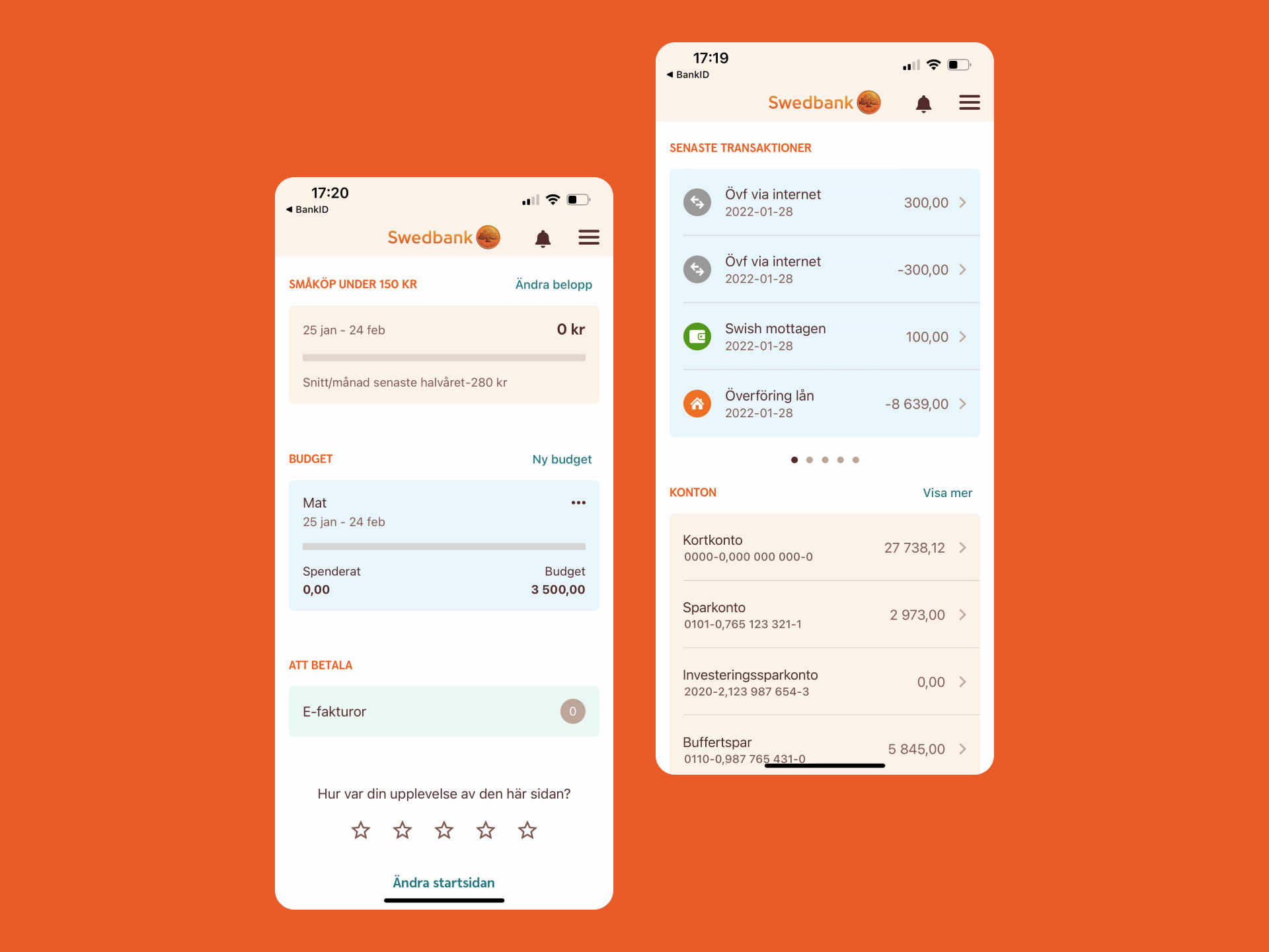
Swedbank offers a range of financial products and services to individuals, businesses, and organizations. It is one of the largest banks in Sweden with over 2 million customers in Sweden.
Challenge
Daily banking refers to the financial transactions and activities that individuals and businesses engage in on a regular basis. How might Swedbank offer a good daily banking experience for all 2 million customers in Sweden?
Outcomes
- Creating user journeys and shaping a reorganization based on user needs instead of feature ownership.
- Coaching and mentoring UX designers, providing guidance and advice in the performance of their functions.
- Delivered a new app home page, including planning, prioritizing, researching, design and stakeholder management.
- Delivered a complete redesign of the personal finance manager that guides in spending and savings.
- Collaborated with customer support to drive down calls and improve guidance in digital flows.
- Run strategic design work within the Daily banking development area.
- Contributed to the internal UX community with workshops, inviting speakers and performing activities to increase the UX maturity.
Case
New App Start Page
What
Swedbank is a full-service bank, offering a wide variety of products to over 2 million customers in Sweden. Two-thirds of these customers rely solely on their smartphones for their banking needs, a number that is estimated to grow in the following years.
Challenge
How might Swedbank provide value as fast as possible for as many customers as possible when using the Swedbank app?
Outcomes
- Deliver the redesigned app home page based on widgets together with the UX Daily Banking team.
- Design of flexible core components in Sketch that other designers could access via the Design System.
- Documentation for designers, developers and business owners on the purpose of the widgets, how to develop them and how to measure the success of widgets.
- Customers mentioned an increase in satisfaction using the home page because they could quicker reach their destination.
- Decrease in internal politics due to how widget management was shaped and in turn drove down the lead time in creating valuable features for users on the start page.
Process
To understand what customers wanted from the app and the most common goal of using it, the UX researcher with designers in the team did qualitative research, interviewing customers from different segments. In parallel, diary studies were conducted, following eight customers for a week, which helped in getting a different perspective on the customers' day-to-day life.
With a better understanding of the customer's needs, the focus shifted from discovery to ideation. A new app landing page started to take shape during multiple cycles, and we quickly moved through a series of user tests to evaluate our decisions, a non-linear process.

Solution
The outcome was a flexible start page containing widgets that can be added, swapped and removed with almost no limits. Moreover, from a customer point of view, it is now possible to decide the most important thing when using the app. For example, some use the budget widget to track how much they can spend in a category, while others want to see their account balance.
The solution was particularly elegant because it removed some of the internal politics when developing for the start page, as the customer decides what to see, not the business.
For the development teams, the new start page was a blessing. A few core components were created as containers that teams could configure and remix, all within the boundaries we had set-out. This meant that designers and developers could rapidly iterate on solutions, knowing they are not breaking the experience for the customer.
Once teams were ready, they could submit their widget to the release train. Teams now have the tools to quickly react to customer feedback and behaviors, without getting stuck in the corporate politics or depending on a specific team to design for the home page.
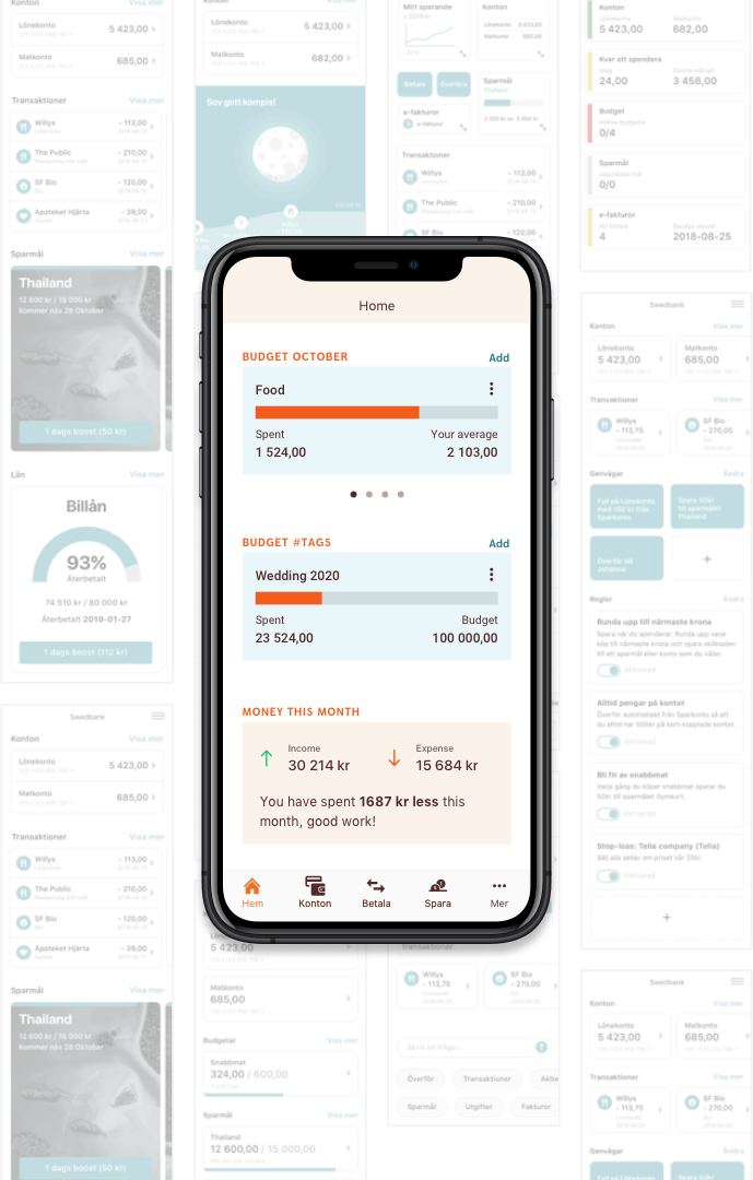
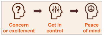
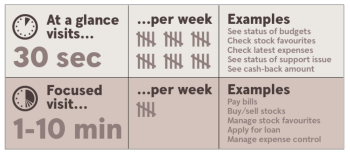
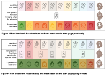
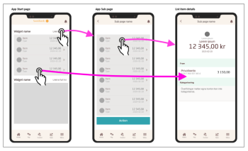
A few months before launching the new start page, a colleague and I went on a tour in the company, informing hundreds of employees on the new start page's possibilities and a framework including guides, principles, and governance. The framework's purpose was to help teams shape widgets consistently and in line with the app design.
A year after launching, we followed up on how the new start page has affected customer satisfaction. Customers said they felt that the app is more relevant to them and supports their day-to-day needs better.
Internally, we spent much less time discussing what each team should and could do for the start page. Instead, they could focus on churning out widgets and improving their current ones based on data.
Projects
FreshsoundIncorporated UX Designer
CapchapUX & UI for a new product
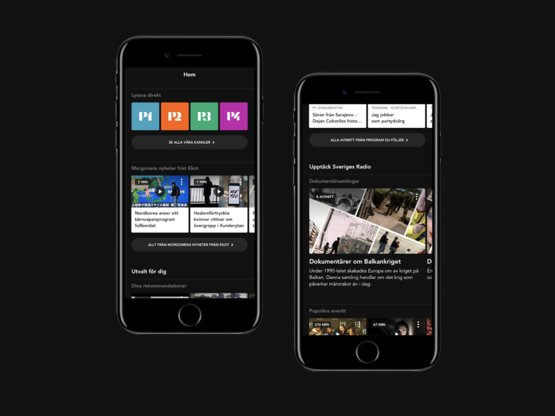
Sveriges RadioIncorporated UX Designer

Electronic ArtsBranding & Incorporated UX Designer

ByvaFounder

Club JDMFounder

im Schlossone night of heavy dreaming
© 2024 arslangolic.com